
How to make a Climate Graph
# How to make a Climate Graph
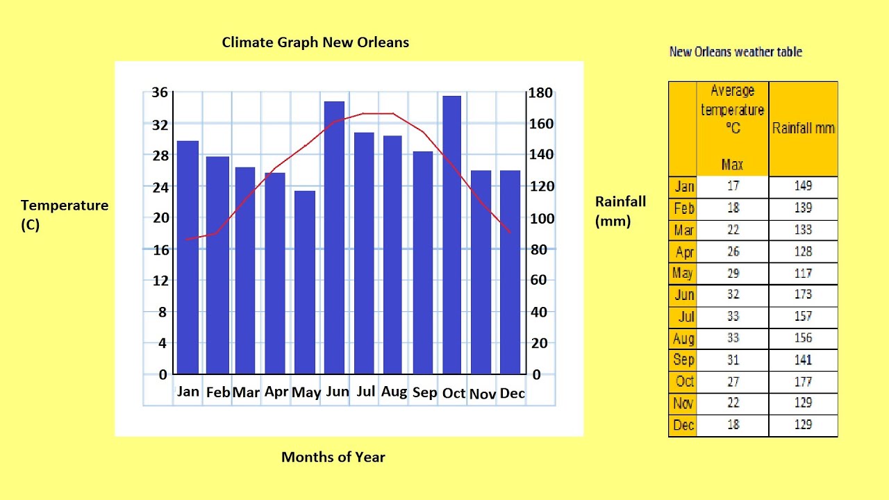
## Understanding Climate Graphs
Climate graphs are useful for identifying climate patterns in a specific location. They consist of a bar graph representing precipitation in blue for each month of the year and a red line graph representing temperature. By examining a climate graph, you can identify the temperature range, seasonal distribution of precipitation, and the amount of precipitation that falls in a location.
## Gathering Data
To construct a climate graph, you first need climate data. In the provided data table for New Orleans in the United States, there are measurements of average maximum temperature in degrees Celsius and precipitation in millimeters.
## Creating the Graph
Begin by using a ruler to plot your X and Y axes. Divide the X-axis into twelve for the different months of the year and label them from January to December. On the left Y-axis, plot the temperature in degrees Celsius, ranging from 0 to 36. On the right Y-axis, label the precipitation in millimeters from 0 to 180.
## Drawing the Graph
Next, draw bars for rainfall and color them in blue. Use a red pen to plot the temperature data. Ensure that the points are centered between each bar before connecting them to create a line graph. Give your graph an appropriate title.
## Observing Patterns
Once the graph is complete, observe patterns from the data. In the case of New Orleans, strong precipitation and high temperatures are evident in the summer months, while precipitation decreases and temperatures become cooler in the winter months. The average maximum temperature in New Orleans ranges from 17 degrees Celsius to 33 degrees Celsius.
By following these steps, you can effectively create and interpret a climate graph to understand the climate patterns of a specific location.
source